
LEVEL DESIGN
This session contains information about my contributions in terms of Level Design. It encompasses three of the four levels which I have worked on: Level 2, Level 4 (Area 1), and Level 7 (Area 2). I also helped building Level 3, however, as I only did Aesthetics, I decided not to put it here.
To jump straight to a specific level, click on the buttons below!
Level 2 "The Garden of Gravity"
My biggest contribution to this project was level 2, also known as “The Garden of Gravity”, I have worked on this map from its early concept stages to final quality.
Design goals:
-
Teach players cube manipulation and cube bridging (making a bridge out of cubes), creating a safe environment where they could understand this important puzzle piece
-
Deliver a playground feeling, allowing players to solve the puzzle without following any particular order, encouraging exploration and experimentation
-
Introduce a first actual puzzle, which challenged players to observe and understand the environment in order to solve it, without ramping up the difficulty excessively
 |  |  |
|---|
Playthrough
MAP HIGHLIGHTS
Multiple solutions to the puzzle:
Although the puzzle designed for this map had one intended solution, during playtest sessions, players were able to solve it in many different, and often valid ways. Solutions that did not break the level’s intended learning aspects were acknowledged and accepted by the design team, as they rewarded players for their creativity and skillfulness. In order to fix the ones that did not contribute or actually broke the intended experience, I iterated on the level layout to prevent them from happening.
Common solution
The most usual solution, players must drop a minimum of 5 cubes in the gravity river, using one gravity field to stack them together as a bridge.
Smart Solution
In this solution, players only need one box to finish the level. They pin the cube to the wall against the gravity river, creating a safe spot to jump and then, ride it towards the exit with a gravity field.
Skillful Solution
Perhaps the hardest solution, this approach is very similar to the previous one. However, players skip the first step (stacking the cube against the river).
Non-linear gameplay:
This level breaks the sense of linearity delivered by the previous one, presenting players with a puzzle that do not require a specific order of steps to be solved – players are able to drop cubes in any sequence, in order to build the bridge to the exit; the only step required is the last gravity field to align the cubes towards the exit. Getting each cube creates a different gameplay experience, which contributes to players’ overall idea of how cubes work within the game.
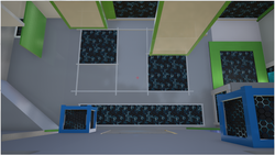
Players may start solving the puzzle from the left area


Or they may start solving it from the right area


“Garden of Gravity” aesthetics supported by narrative:
The map layout along with the narrative and sound effects deliver the aesthetics of a “garden of gravity”, creating a peaceful environment for players. The gravity fields behave like rivers, carrying the rocks (cubes) through the streams, while the incredible narrative work (done by Alex Shilts) that reacts to player’s actions, complementing the calm feeling of the level.

Describe your image.

Describe your image.

Describe your image.

Describe your image.
DEVELOPMENT PROCESS
This level has gone through a fun, iterative development process. I worked on its original paper concept, designing it to be a playground area right after players acquired the gravity manipulation ability – which included the “Garden of Gravity” theme. However, early on Whitebox, we understood that there was not enough development nor gameplay time to have that kind of level in our game. So, I went back to paper design and merged the playground gameplay, which we still wanted, with a puzzle that made players understand cubes as puzzle pieces and their ability to stack on each other (bridging) – something needed for that moment of Gravitas. I also kept our original “Garden of Gravity” theme from the first design, which later proved to be useful for the narrative and the aesthetics.
 |  |  |
|---|---|---|
 |
During the Whitebox stage, the level’s size and amount of possibilities concerned us: we were afraid players could get lost, not knowing what to do. Our Gameplay playtest sessions proved us right: players liked the freedom, especially after beating level 1, which was linear, but they felt overwhelmed. Analyzing their feedback, the design team concluded that the actual issue could reside on the amount of “fieldable” surfaces (panels where players could shoot gravity fields).
 |  |  |
|---|---|---|
 |
Along with the lead level designer, I iterated on the level several times, changing it so players would not get lost, but still have various paths to explore. As a result, we ended up removing “fieldable” surfaces that did not contribute much to the gameplay and shrinking others to be enough for their intended purpose. On top of that, I added a higher platform from which players start the level. This way, they are able to see the majority of the level early on, having a clear idea of their puzzle pieces and goals.
 |  |
|---|---|
 |  |
 |  |
 |  |
 |  |  |
|---|---|---|
 |


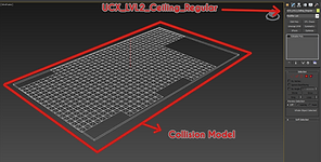
All these changes contributed to establishing a clear level objective and allowed players to experience its intended gameplay. However, playtest revealed a bug with our game mechanic: when boxes fell in the intersection of two gravity fields, they would get stuck on the intersection, oscillating between them. This was a problem in implementation of the gravity fields but fixing them would take too much of the programming resources, something we did not have for the moment. Therefore, I added surfaces on top of the corners along with blocking volumes to prevent cubes from falling into gravity field intersections. These changes also helped preventing boxes from being stuck in other weird level geometries. Later, programmers fixed that bug, so I could remove the surfaces – but still kept the blocking volumes to define the level geometry properly.
Then, I started the Aesthetics phase. As I meshed out the map, I kept a constant communication channel with the lead artist: I wanted to deliver the “Garden” theme, while keeping the map look cohesive to the rest of the game.
Finally, after finishing this phase, I collaborated with other level designers to stitch level meshes, sealing walls, and other surfaces in order to improve the lighting quality of the map.
LEVEL 4 "Surprise" - AREA 1
Part of my responsibilities was also to design and build the first area of level 4 (level also known as “Surprise”).
Design goals:
-
Teach players a new mechanic: how to use cubes to break glass
-
Implement the wreck-a-hedron (a “wrecking box”) sequence, a set piece that introduces the curator’s destructionist phase and adds a unique gameplay moment to Gravitas
 |  |  |
|---|
Playthrough
MAP (Area 1) HIGHLIGHTS
Unique wow moments:
As part of the design goals, this area delivers unique story beats that tie gameplay to narrative, creating an awesome moment that surprises players, while introducing them to a new mechanic. As players walk to area 1, a wrecking box smashes the viewing room’s glass in front of them, presenting the idea of breakable glass. After that, they need to manipulate the wreck-a-hedron in several and unique ways to break glass panels, understanding how cubes interact with that new gameplay piece


DEVELOPMENT PROCESS
In this map, the lead level designer and I worked together on its paper design, Whitebox and Gameplay stages. As part of the requirements, we had to introduce the breaking glass mechanic, while presenting it with this set piece that was part of our story script – a “surprise” with the Wreck-a-hedron. The lead handed to me a very first sketch of area 1’s overall flow, which I based upon to design it on paper (it was on the whiteboard, actually). As he was also working on area 2, we coordinate the transition between areas since their early concept phases, which contributed to a successful Whitebox, without any time wastage on the integration process.

After finishing Whitebox, we moved to Gameplay. This stage was more challenging, as the Wreck-a-hedron gameplay object was not ready by that time, I had to work on its blueprint, implementing the required functionalities in order to keep the production on schedule. During that process, I worked with the Writer and the Game Designer to keep the sequence as intended, using the level blueprint to script it.
 |  |
|---|---|
 |
Moreover, playtest showed that players took a long time to understand a core piece of gameplay in area 1: riding the wrecking box. As Gravitas did not required that so far and the movement itself did not seem to be safe, they either tried to jump on top of it as a last resort or tried in the beginning, failed, and never did again. Fixing that was a collaborative work among level designers, programmers, and artists.
 |  |  |
|---|
I changed the level layout to facilitate the jump to and from the wreck-a-hedron, extending platforms to make them more accessible from the wrecking box; programmers polished its blueprint, making the box swing smoother and more reliably; finally, artists made a platform asset to go on top of the wrecking box – this platform worked as a claw, holding the cube, while making more clear that players could jump on top of it. I added that asset to the Wreck-a-hedron blueprint, creating an animation of the grips releasing the box.
After, as I shifted to another level and teammates started working on this one to take it to shippable quality.
 |
|---|
 |
 |
 |
|---|
 |
 |
LEVEL 7 "The End" - AREA 2
I also worked on area 2 of level 7 (level also known as “The End”), from its design to shippable quality stages.
Design goals:
-
Create a sense of urgency and danger, pushing players to solve the puzzle quickly but giving them enough time to figure it out
-
Close the circle, connecting this area to the beginning of the game and delivering a complete experience
 |  |  |
|---|
Playthrough
MAP (Area 2) HIGHLIGHTS
Unique “A-ha” Moment:
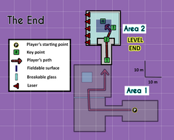
As lasers slowly go down to kill players, pressuring them to figure a way out, the fact that players use the main lobby’s center piece to break out the room delivers a unique “A-ha” moment, making players feel intelligent, by outsmarting the Curator with an unexpected maneuver in a dangerous moment.


DEVELOPMENT PROCESS
Level 7 has gone through a complicated development process, as it was a late addition to the team’s backlog and did not have as much iteration time as other levels. As we approached the Alpha milestone, the team realized seven levels (0 – 6) were not enough to present our whole story and make a complete experience. So, we decided to add a new “extra” level, a short sequence to close the game and I was responsible for designing and building it.
Originally, I designed level 7’s areas 1 and 2. As we did not have much time, with its approval by the leads, I jumped straight into meshing the map and adding the necessary gameplay bits. However, playtests revealed that gameplay did not fit our game flow: the original requirements demanded an action sequence, with destructible environment and twitchy puzzles. Although the team found that super cool, players got lost and could not really figure out what was going on. In general, the level felt too different from the rest of the game in both gameplay and aesthetics aspects.
Running against time, the design team got together and discussed ideas to deliver what Gravitas needed without changing too much of what we had. The result was a complete rework of area 1, done by the lead level designer, and adjustments to area 2, which I was responsible for. Area 2 overall feedback consisted of two main points: not enough time to figure out the puzzle and visually overwhelming elements.
 Player Platform 1 |
|---|
 Player Platform 2 |
 Robot 1 |
|---|
 Robot 2 |

Game Overview
I addressed the former by decreasing the speed lasers went down, which kept the urgency without removing the feeling of eminent death. In addition, I removed all the destructible pieces from that area, keeping the puzzle elements clear – debris that fell from the ceiling blocked players’ sight and overwhelmed them. Finally, adding spotlights to the bottom of the Main Lobby's centerpiece helped players noticing it, as they could see its shadows on the room.

Scripting


